Design
How the
studio draws.
And why.
How the studio draws, and why. The mark taken apart, the system it generates, and the receipts from building both, including the parts we built and then threw away.
A butterfly that is not a butterfly logo
Chaos theory is not a theory about disorder. It studies systems that are entirely deterministic and still impossible to predict, because they are sensitive to where they start. Change the initial condition by an amount too small to measure and the outcome is unrecognizable. That sensitivity has a popular name: the butterfly effect.
It is also a fair description of building software. An idea looks unruly, behaves as though it were random, and turns out to obey rules once you find them. The mark was drawn for that, and the name the studio now carries points at the same structure from the other end: an attractor is what a system like this settles into. The homepage states the premise without decoration: ideas are plentiful, working systems are rare.
Which left the mark with a specific problem. A butterfly is the most obvious symbol available to a studio working out of chaos theory, and the obvious symbol is decoration: it illustrates the name and says nothing else. So this is not a butterfly with two matching wings. It is the effect itself, drawn as a system. One intelligence core. Recurrence entering it. Ordered orchestration leaving it.
Read across, it is the sentence the studio works by. Circulate an idea until a direction becomes coherent, compose it into a working system, then let that system route the work out until it lands as something real. The shape it happens to make is a butterfly. That is the joke, and it is the last thing about it that matters.
The mark, taken apart
Four parts, one node. The drawing below is the live component with hairline leaders run out to it, so this diagram explains the mark the site is actually serving rather than a picture of an older version.
01 · Orbit loops
The left side carries recurrence: ideas circulating through research, testing, model dialogue and iteration until a direction becomes coherent. Four loops in two pairs, a forewing pair and a hindwing pair with different rotations and proportions, so no loop matches another.
02 · The crossings
The loops cross instead of nesting. Each crossing is a place where two paths meet without resolving, and at small sizes it is the first thing any simplification wants to clean up. We tried that twice and put them back. They read as intentional motion, and they are what the mark is.
03 · The intelligence core
A hollow ring at the center, where the eye lands first: the studio's operational brain, where intent, context, memory, models, skills, tools and human judgment are composed into a working system. In the chaos-theory reading it is also the initial condition, the originating state every other part is measured from. The filaments do not start at its center, they start inside its stroke band, so they connect to the ring with no loose end visible inside the hole.
04 · Realized systems
The right side is orchestration resolving: the core routes work through the right models, skills, tools and human checkpoints, and each path ends in something real. Five filaments leave the node on a breathing fan and end on a single arc, each one closing in a hollow ring placed to kiss its line end rather than swallow it.
Nothing on the left is mirrored on the right. That asymmetry is what keeps the mark active and unpredictable without letting it become messy: recurrence on one side, realized systems on the other, and a single core holding the two apart.
The system it generates
The same argument, extended to everything else. Every specimen below is rendered by the site's own variables, so what you are reading is the system running, not a picture of it.
Three faces, and one that is not ours
Display
Archivo Black
--font-archivo-black
Headlines, chapter names, the hero. It shouts.
Working systems
Text
Archivo
--font-archivo
Body copy and everything that has to be read at length.
An attractor is the structure a dynamic system moves toward. Find the structure an idea can hold, compose the intelligence around it, and build what follows.
Chrome
IBM Plex Mono
--font-plex-mono
Labels, datelines, indices, figures. It whispers, at 11px.
CHAPTER 03 · WORKS · 2026
Not a studio face
Cinzel
--font-cinzel
Loaded for one chapter only. Ancient Oasis has its own display face, and a studio that overwrites its subject's voice is advertising itself instead of the work.
Ancient Oasis
Four grounds
Light and dark are not modes here. They are two halves of one print, chosen per frame and pinned.
Night
#090b11
The film ground. Chapters, this page, the dark half of the site.
Plate
#0c0e16
One step up from night. Museum mounts sit on it so they separate.
Paper
#f6f7f9
The light ground. The premise, the technical plates.
Ink
#0f1119
Near-black. Every stroke and every letter on paper.
One jewel
Cool only. The palette holds indigo, cobalt and violet, and red is reserved for things that are actually wrong.
Deep indigo
#3f51b5
On paper.
Bright indigo
#8c9eff
On night.
One cool jewel does all the structural coloring: rules, ticks, indices, the primary button, link hovers, and the one bar that matters. Nothing is colored to be colorful.
Seven laws
Outline type is the chaos voice. Solid fill is the order voice.
Two treatments of one face, carrying opposite meanings. A headline that hollows out is unresolved; a headline that fills has landed.
Every grid carries exactly one deliberately perturbed element.
One cell rotated, one line indented, one bar in the jewel. Order everywhere, and a single place where it does not hold.
Hairlines over shadows. Radii of 2px, 999px, or nothing.
Structure is drawn with a one-pixel rule, never faked with a blur.
The mono whisper answers the display shout.
Chrome is 11px and tracked wide. Headlines run to 8.6rem. Almost nothing lives in between, so the page has a top and a bottom and no mush in the middle.
Grounds are pinned hexes, never theme tokens.
One print. A ground is chosen for the frame it is in and does not shift underneath the work.
A subject's color stays quarantined inside its chapter.
AfterHue's warmth and Bitcoin's orange do appear on this site, inside the chapters that own them, down to the labels in the margin. They never travel outside. They belong to the work, not to the studio.
Motion is CSS, and it yields.
No animation libraries in the dependency list. Every animation has a prefers-reduced-motion answer, and the scroll reveal is one attribute flip with CSS owning the transition.
Receipts
This is the part that actually describes how we work, so it is here with the numbers left in. The mark went through three critique rounds, seven alternate drawings and two attempts at a separate small-size symbol. Everything except the original lost.
Three rounds, and what moved
Round 1 · the tips
The filament tips became hollow rings in one ink at the wing stroke width, each center placed one radius past its endpoint along the exit tangent so the ring kisses the line instead of swallowing it. The body ring went hollow too. This is also where the accent left the mark: it paints nothing now.
Round 2 · the separation
Wing pairs separated by 1.2 units, upper up and lower down, so the groups part near the body. Tips down from r 2.2 to 2.0 so the body ring stays the dominant node. The two longest upper-right filaments pulled back about 1.5 along their exit tangents, which took the right-heaviness out.
Round 3 · forewing and hindwing
Both wing groups pulled 1.2 toward the body. The lower pair rotated away from the upper, to 33 and 46 degrees, with stubbier and rounder proportions, so the upper pair reads forewing and the lower hindwing instead of two of the same thing. The fan re-spread to tip angles of -61, -40, -13, +34 and +63, with all five ends riding one arc so the right contour is clean without being plotted.
Two drawings built to lose
The first small-size attempt cut the mark to two loops and three filaments on a heavier stroke. It was the most legible thing the process produced, and it lost on exactly that: more legible, less authored. Stripped of the crossings and the fan it stopped being chaos resolving into form and became a cute icon.
The second kept both wing groups and reduced the inner loops until they nested instead of crossing, taking the stroke from 1.7 to 2.1, which at 16px is the difference between a 0.42 and a 0.53 pixel line. It came out marginally cleaner and no more recognizable, and it did not fix what it was built to fix: nesting left 0.99 units between the loop centerlines under that 2.1 stroke, which is negative daylight, so the apertures closed anyway. At 24 and 28 the original simply won.
Two things came out of that which no amount of drawing would have settled on its own. The original survives shrinking better than anyone expected, and every simplification removed more identity than noise.
The Orbit Wing, in the tab
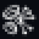
The renders that settled the favicon, shown as the real rasters the tab serves, true size and pixel-enlarged. The wing is the mark's own upper pair, verbatim: unequal loops, offset centers, the compressed root. At 16 the full mark is a smudge and the wing is a glyph; at 32 the wing is crisp where the full mark is busy. The full butterfly returns at platform-icon sizes, 180 and up.
Full mark · 16px

00W Orbit Wing · 16px · serving


Full mark · 32px

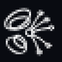
00W Orbit Wing · 32px · serving


favicon.ico serves 00W at 16 and 32 · apple-icon 180 is the full mark · masters in /public/brand
That comparison is the method in one image. Nobody argued about which icon was better. Both were cut as real rasters, opened at the size a browser tab actually renders, and the pixels settled it. We measure, we test on the surface the thing will really live on, and we retire whatever loses, including our own work.
Using the mark
One ink, no accent
The mark draws in currentColor throughout and paints no jewel. It takes the color of the text around it, which means it works on any ground we own without a variant.
Full butterfly at 180 and up
Platform icons, headers, plates, print. Above this size every part of the drawing resolves and the crossings do their work.
00W, the Orbit Wing, below that
The mark's own upper wing pair, verbatim, holds the favicon and ultra-small duty at 16 and 32. It is a crop of the mark, not a second drawing.
The wordmark names, the mark signs
Set the studio name in the wordmark when the job is naming. The mark is a signature, not a label, and does not need the name beside it to work.
Clear space
Keep one body-ring diameter clear on every side, which is a tenth of the mark's own box. Nothing crosses it, including rules and captions.